This is an internal project I worked on during my full-time role at Coolmate, where I took on a dual responsibility as a UI/UX Designer and had the opportunity to also work in the role of a Product Manager.
As Coolmate went through a brand repositioning - defining clearer target audiences, launching frequent sales campaigns, and rolling out new product features - the website naturally became more complex. To support this growth, the product needed a stronger, more structured foundation.
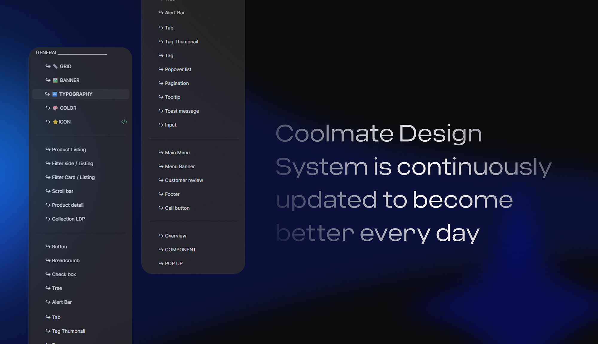
That’s where the idea of building a basic but practical Design System began.
We were a small team, constantly busy with campaigns, deadlines, features, and bug fixes. The design system wasn’t something we could dedicate full-time resources to - it was built gradually, during lunch breaks, between releases, and whenever we could squeeze it in...
It wasn’t perfect.
But somehow, it worked.
___
Without a shared design system, consistency quickly became a challenge.
🫸 Designers adjusted padding, spacing, and layouts based on personal judgment or past files.
🫸 Developers reused whatever values or components were closest in the codebase.
🫸The same components were rebuilt multiple times with slightly different behaviors and visuals.
🫸 Design and development decisions often turned into subjective debates instead of clear answers.
As the number of tasks and new features increased, these inconsistencies began to create real costs.
They consumed design time, slowed down development, and increased rework.
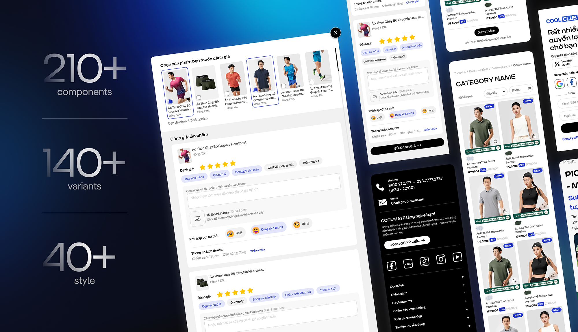
In some cases, a single component defined once in design could end up as dozens of variations (60+) in the codebase, making the system increasingly difficult to maintain as the product scaled.
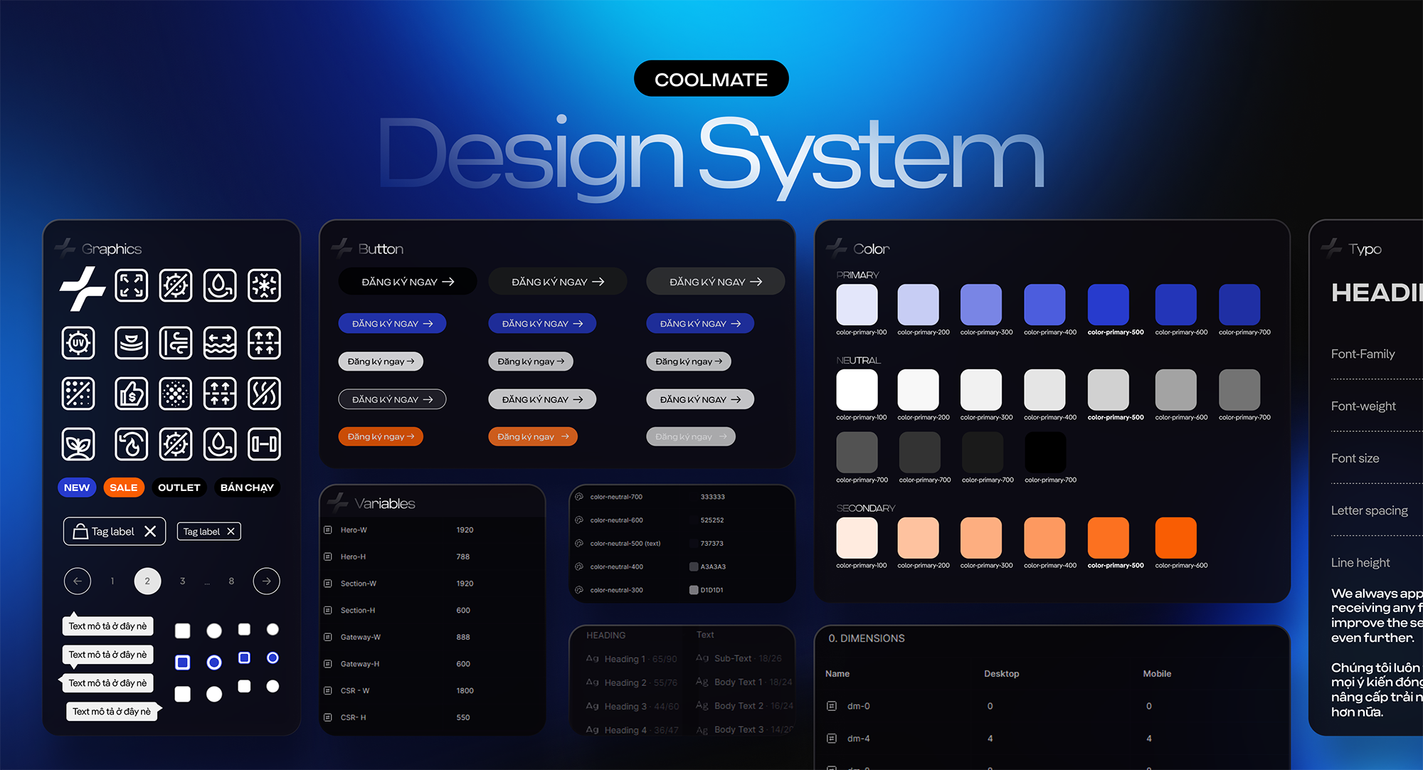
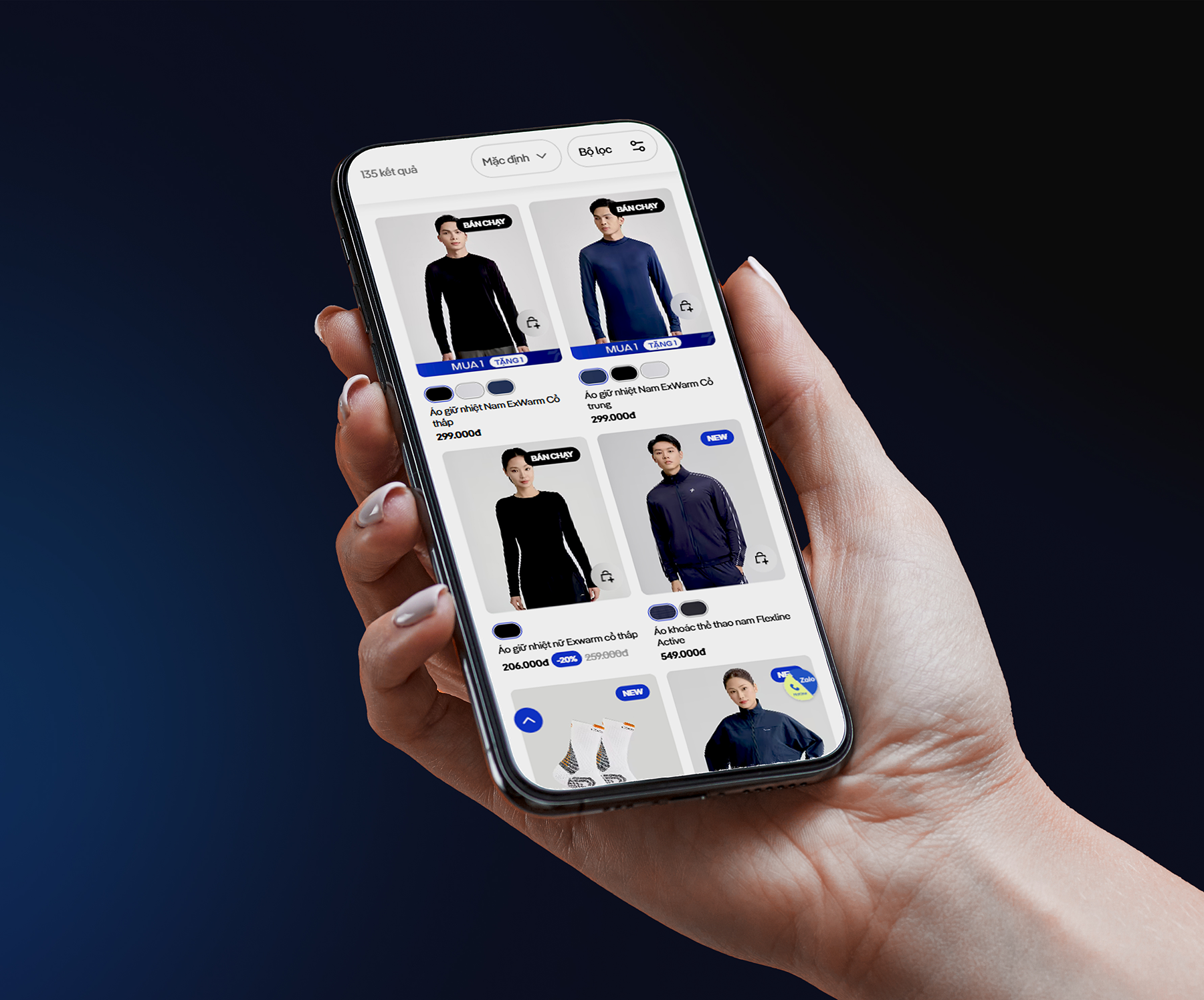
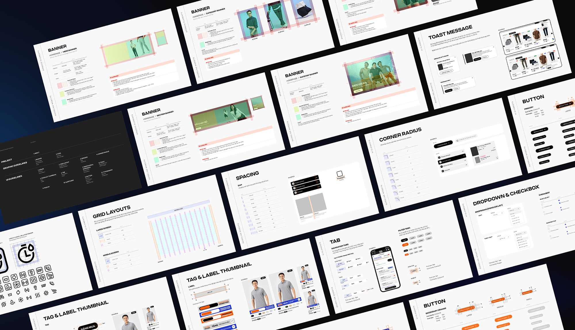
We built a lean design system focused only on what truly mattered.
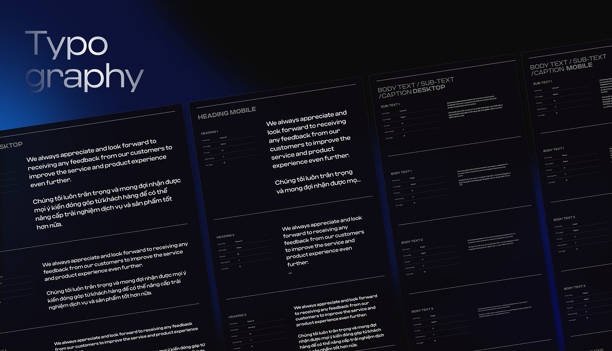
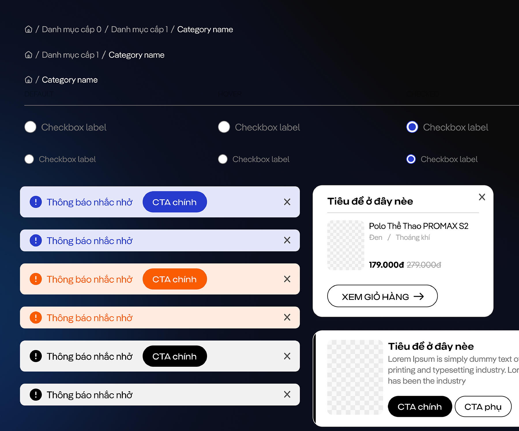
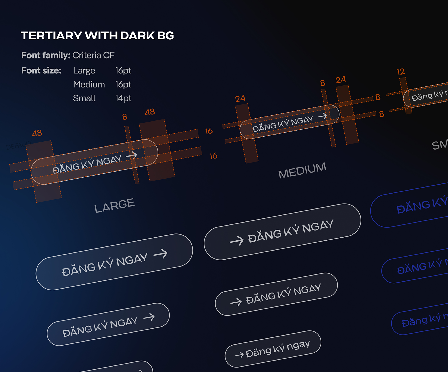
⚫ Defined core foundations: color, typography, spacing, grid, and reusable components.
⚫ Prioritized practicality over completeness - no heavy documentation, no over-engineering.
⚫ Designed the system to evolve incrementally alongside real product work, not as a one-time effort.
⚫ Kept it easy to use for both designers and developers, without adding extra overhead.
The system was never meant to be final - it was built to grow through real usage, iteration, and feedback.
The design system became a single source of truth for our team.
⚫ Design and development decisions became clearer and faster.
⚫ Questions like “Which color should we use?” or “How much padding is correct?” had clear answers.
⚫ Design and code were aligned from the start, making the website redesign and feature rollout much smoother.
⚫ The same guidelines were later applied to graphics and campaign materials, creating consistency across touchpoints.
Most importantly, delivery speed improved significantly.
Before the design system, designing a landing page could take up to a full day, and even small features often required several days of design and development.
After the design system was in place, initial setup time was greatly reduced.
Landing pages no longer needed to be designed from scratch, and developers could reuse an existing codebase.
In many cases, the time from brief to go-live was shortened to within the same day.
Design system didn’t limit creativity - it gave our team a clearer foundation to build on.
Special thanks to the team who made this possible.
Credits:
Me (aka Trang Nguyen) - UI/UX Designer & Product Manager
Mai Tran - UI/UX Designer
Hieu Nguyen - Frontend Developer
.svg)