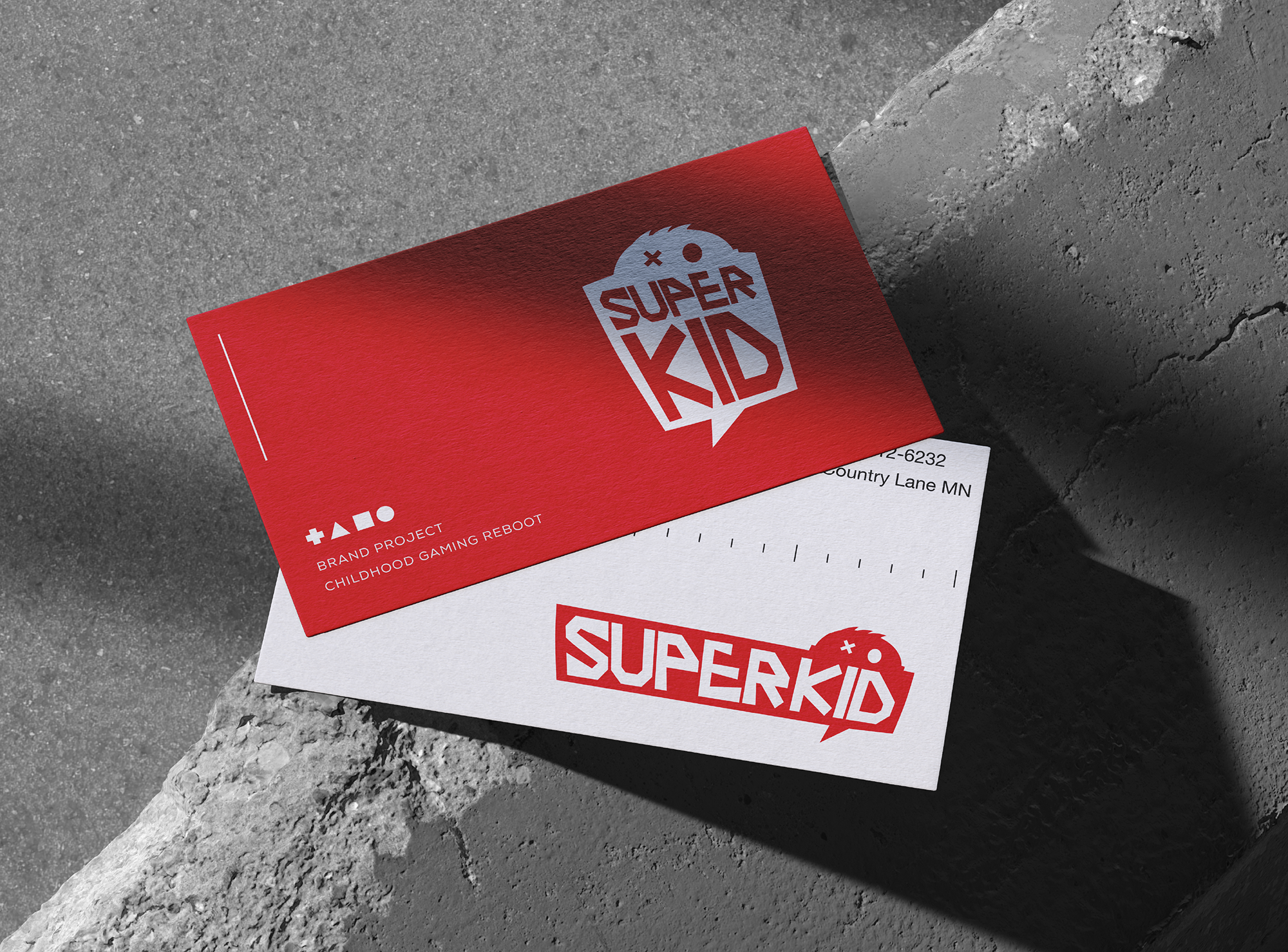
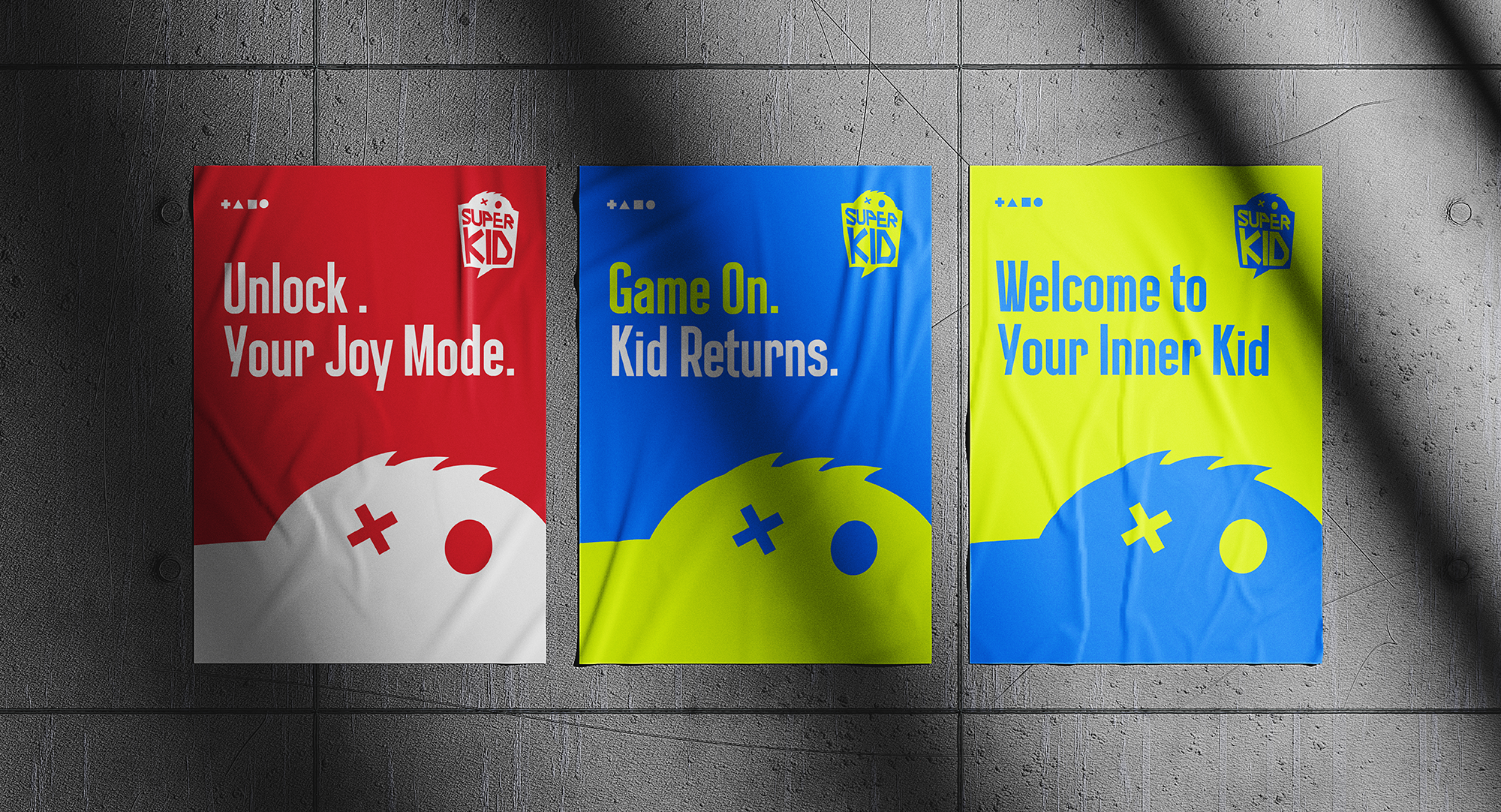
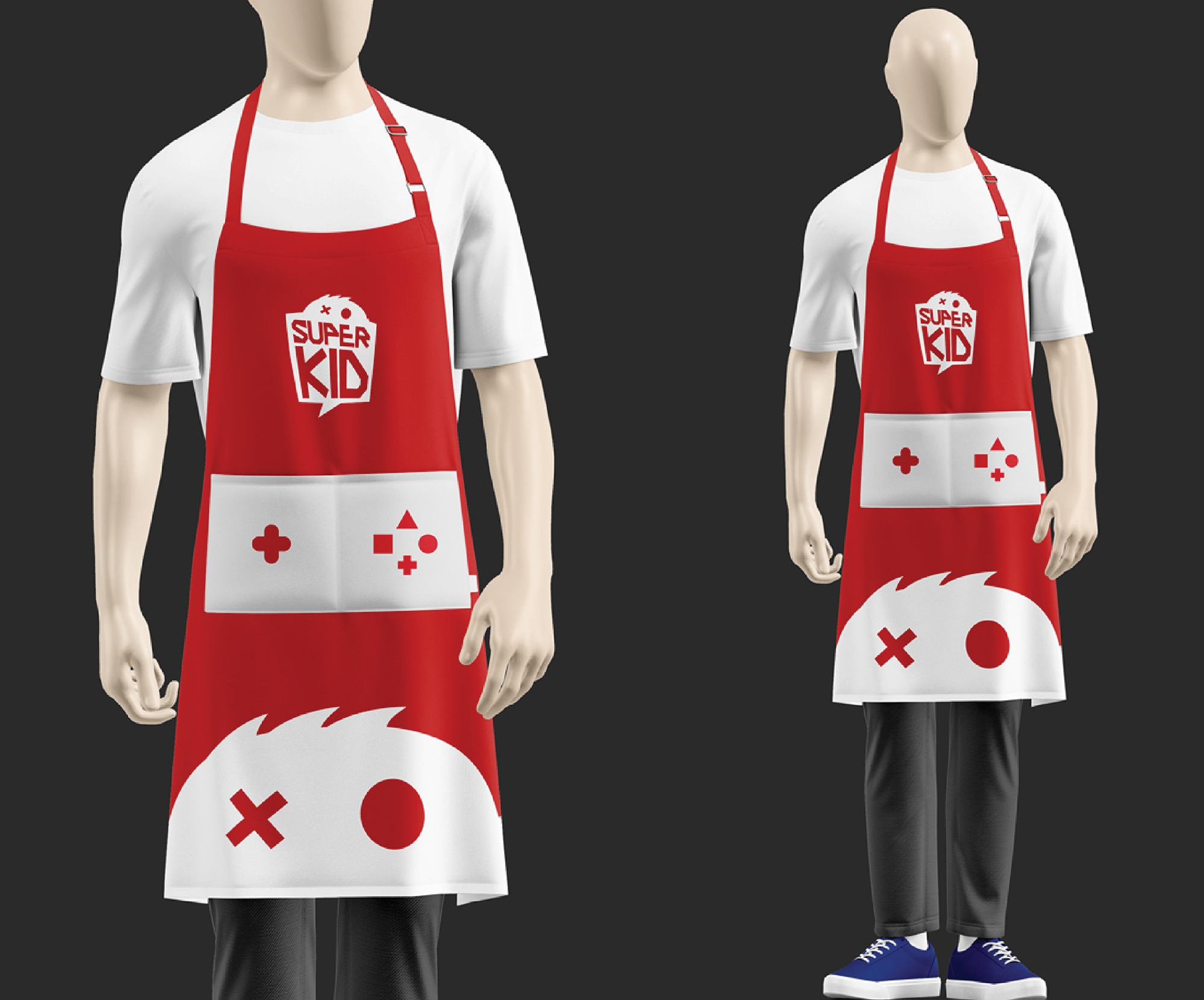
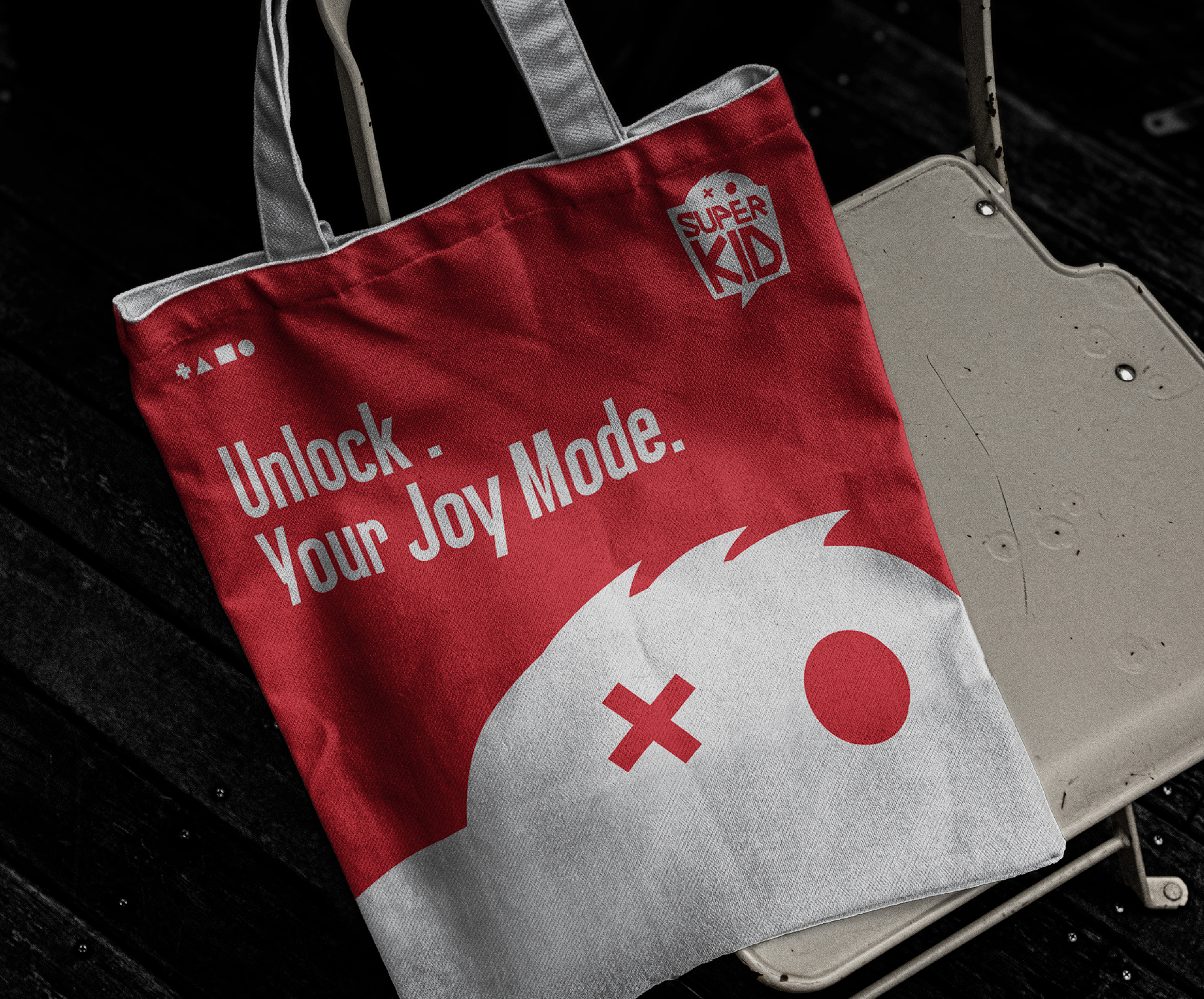
SUPERKID is a gaming retail brand that provides not only gaming devices but also immersive entertainment experiences — reconnecting users with the joy and excitement of play.
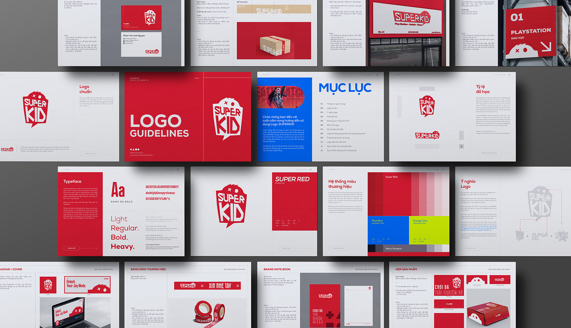
The logo is inspired by a chat bubble, symbolizing connection, interaction, and shared experiences.
Inside, the SUPERKID wordmark is combined with a subtle “kid” figure, representing curiosity, playfulness, and exploration.
This concept reflects the brand philosophy:
“No matter how grown up we are, there’s always a kid inside us who once dreamed about games, adventures, and playful worlds.”
SUPERKID goes beyond selling products — it reconnects users with their inner child and the excitement of gaming.
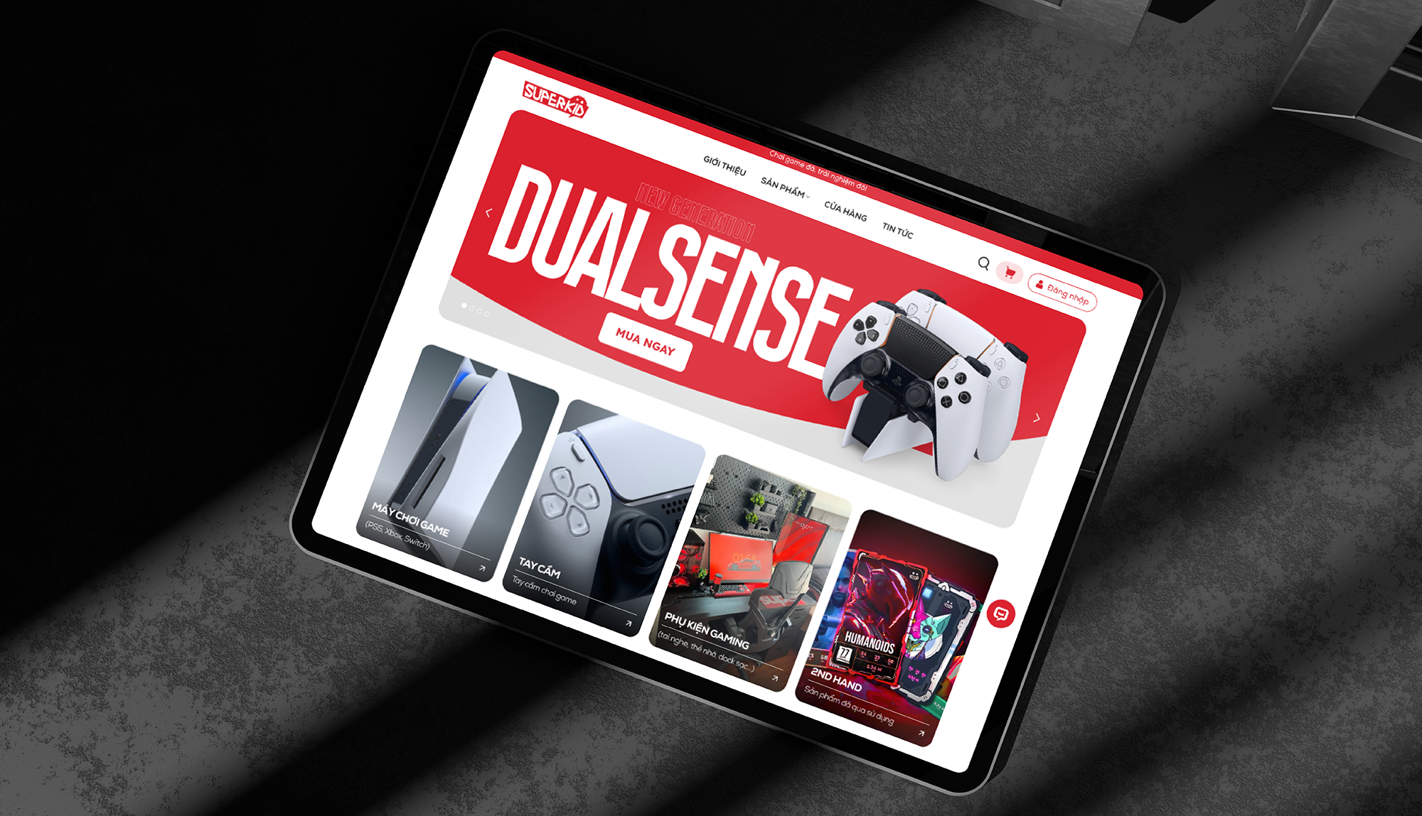
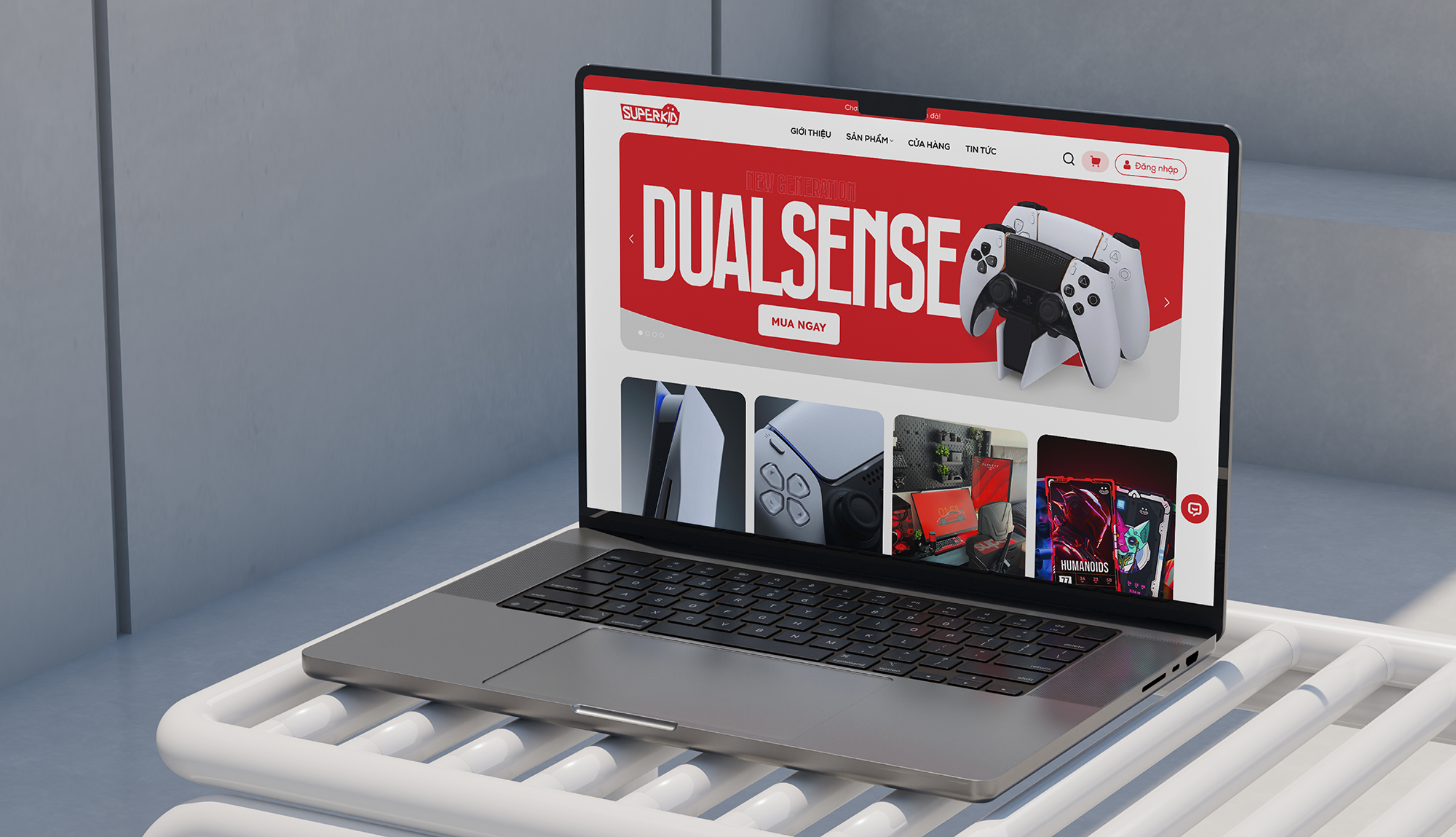
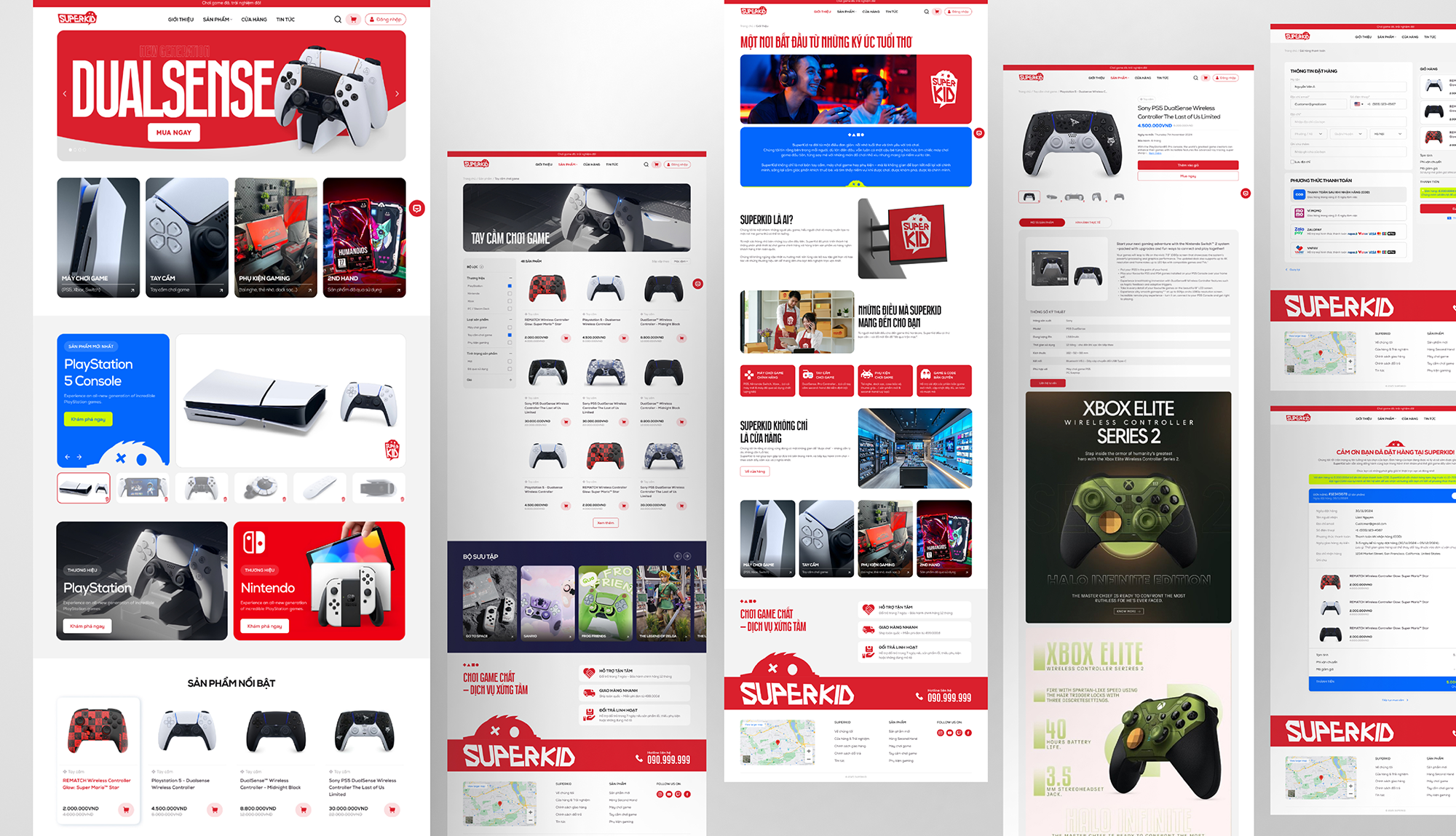
Website is designed with a minimalist approach, focusing on its core purpose: clear product presentation and efficient shopping experience.
⚫ Clean, scannable layout
⚫ Strong focus on product listings (consoles, accessories, game discs)
⚫ Simplified user flow to reduce friction
⚫ High emphasis on product visuals and CTAs
SUPERKID prioritizes a fast, intuitive, and conversion-driven experience over unnecessary visual complexity.

SUPERKID now has a more consistent and recognizable brand across both retail and digital touchpoints.
The shopping experience is simplified, helping users browse products and make decisions faster.
More importantly, the brand starts to feel more playful and relatable — true to the idea of reconnecting users with their inner child.
.svg)